Page Layout: Wk 05 Layout Using Golden Mean Pt 3
ILLUSTRATOR / PAGE LAYOUT / TYPOGRAPHY
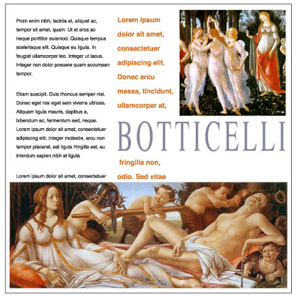
Designing with a grid is not only crucial for a successful design, it is also time saving and satisfactory results can be achieved with little effort.
In this exercise, a 20x20cm layout is designed using the measurements attained from the golden mean
Start with three images, headline, sub-head, and three paragraphs of copy.
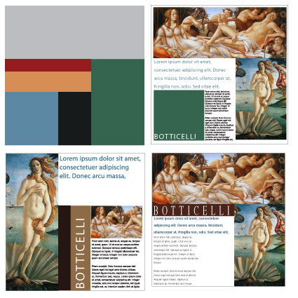
STUDENT EXAMPLES
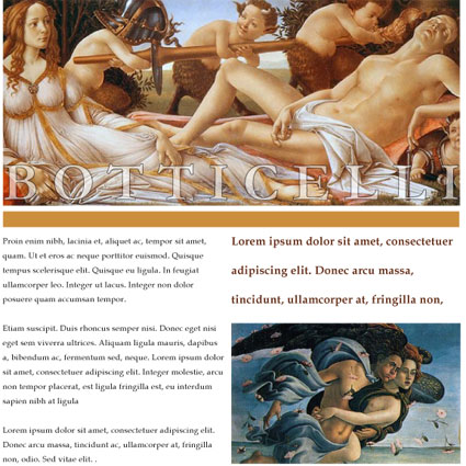
The first week of this exercise, students are given just the text, images and document size, and told they have just one week to design a layout. The results are as expected:
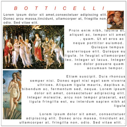
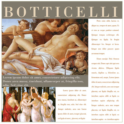
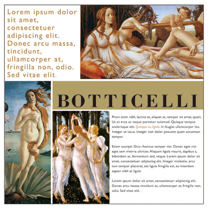
The next week, the Golden Mean is introduced, and the students are told to construct the page using the mean, and crop and scale images and text according to the mean. The next week, the results are a great improvement
Align
Windows > Align will give you your align tool select the objects you want to align, and choose your align option.
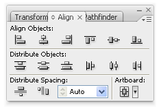
Distribute spacing is a good option if you have objects you want spread evenly across a specified space.
Leading (Linespacing)
Leading (or Linespacing) can be used for interesting effect with your sub-titles. Do not change your leading for your body text (yet).
[Ctl + T] Window > Type > Character
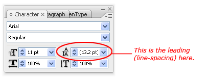
Default value (in brackets) is automatic. This will be adjusted automatically when you change the text size.
The shotcut to adjust the leading is Alt + up/down arrow keys.
This week's assignment
Create 4 x 20x20cm page layouts. Create a golden mean grid
Your first layout will use one image.
Your second layout will use two images.
Your third layout will use three images.
Your fourth layout, you decide how many images to use.
Pay attention to your image and text alignment. Make sure your objects align to the top/bottom where appropriate.
Print your 4 layouts on one A3 (landscape) before the start of class, next week.