Page Layout Wk 07: Golden Mean Proportions and Grid
This week create 4 non A4 size layouts.
Creating a grid should be becoming instinctive. You can now try designing using different proportions.

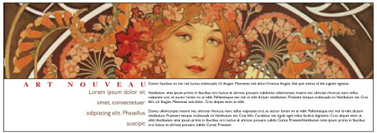
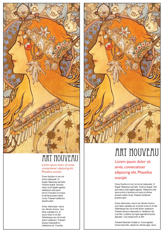
Layout using a 6x6 grid

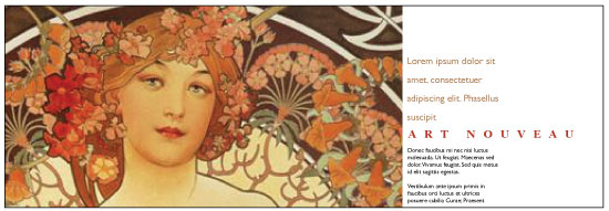
Layout using the golden mean proportion of 1:1.618

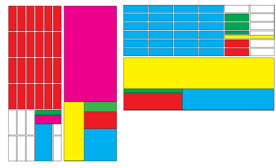
Above: Layout on the left is using a 6x6 grid. The layout on the right is using the golden mean ration. Below is the layout breakdowns for all the design examples.

Create two layouts, approximatly 9.5cm wide by 28cm high.
Make another two layouts, 28cm wide by 9.5cm high.
Using the images provided, create four original layouts - one horizontal, and one vertical using the golden mean proportion, the other two (horizontal and vertical) using a 6x6 grid.
You can use as much body text as you wish. You can use any number of images.
Pease be aware of your design elements alignments. Make sure tops and bottoms align appropriatly.
Due next week.
Print your layouts on 2 x A4 paper.